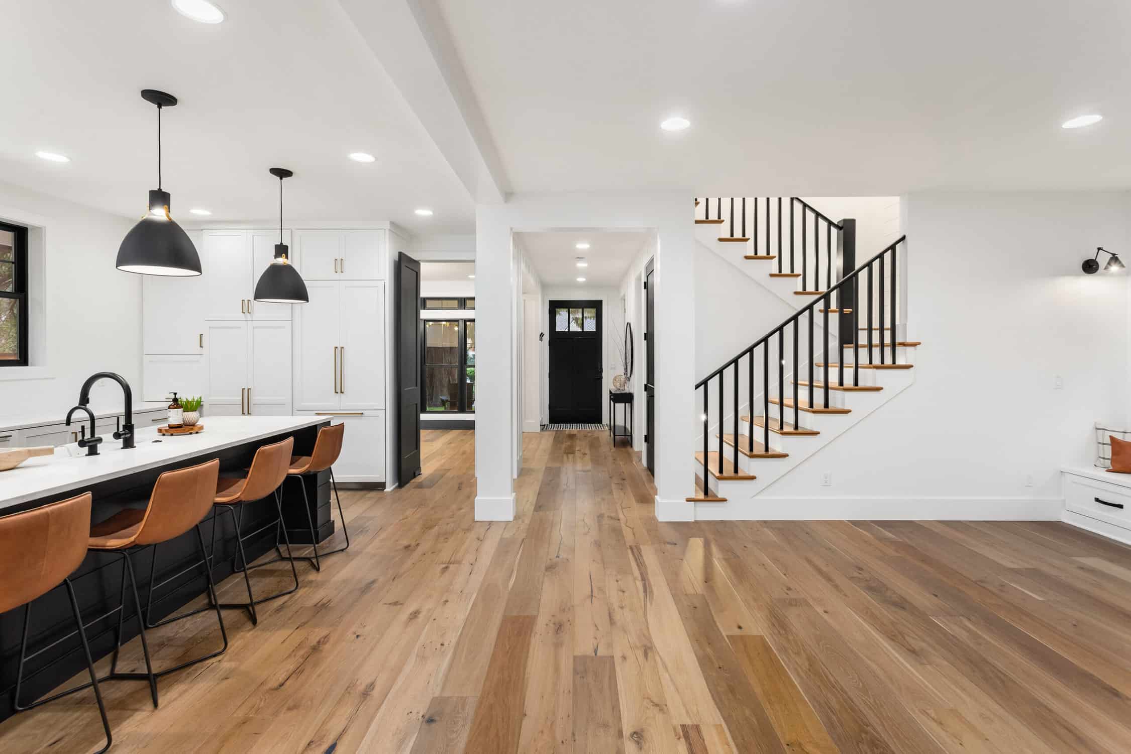
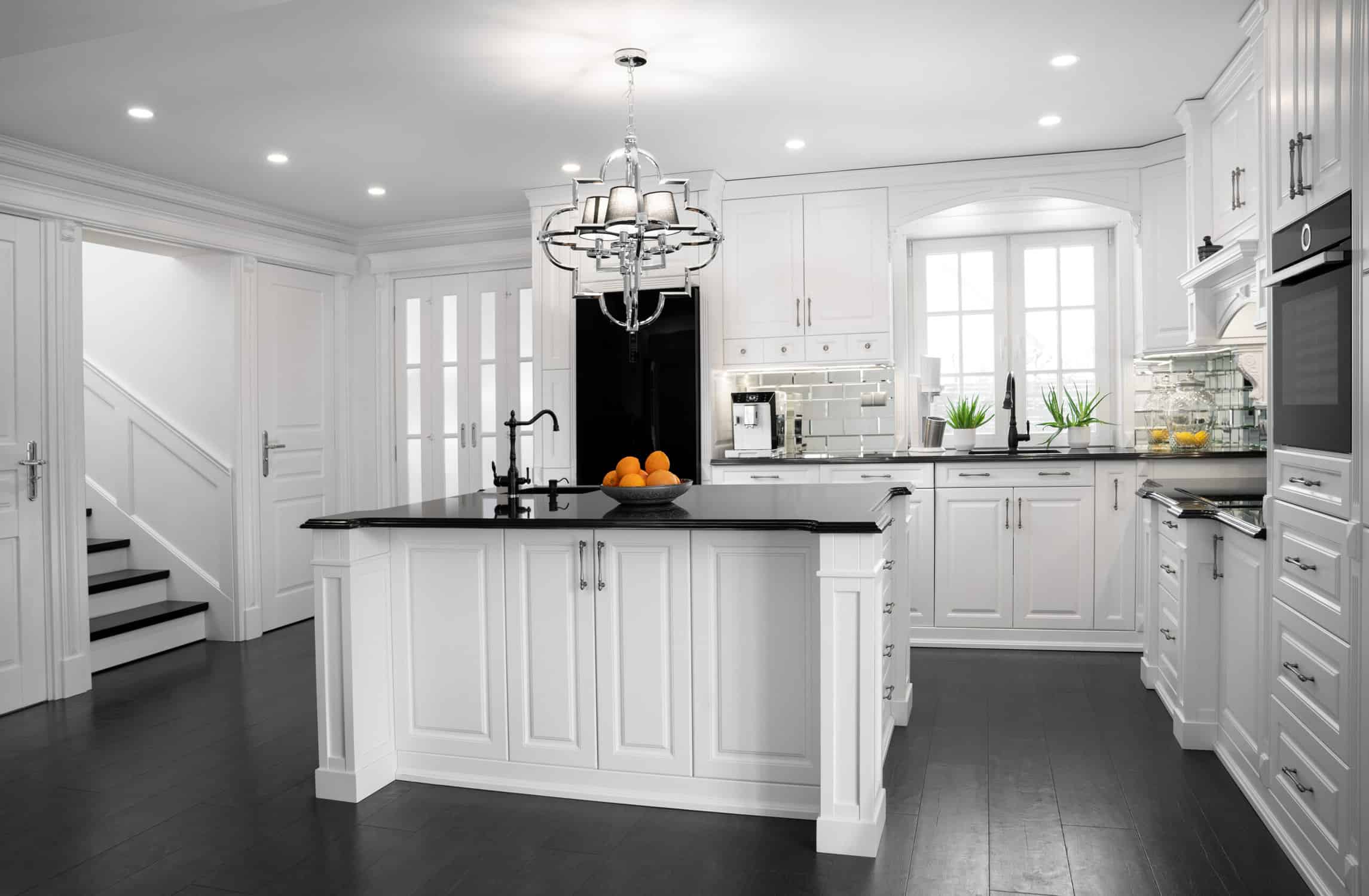
Spring colors for interior spaces are always a hit this time of year, and there’s no better excuse to start your interior house painting in Venice, FL than the warm spring breeze rolling in. With the humidity settling down and the sunlight softening, your walls are practically begging for a makeover. It doesn’t take much—just a well-chosen color and a solid paint job—to completely transform your space.
As an interior house painter working along Florida’s Gulf Coast, I’ve seen how much spring affects a room’s light and feel. The shift in seasons is subtle down here, but it’s still the perfect time to roll out new tones that feel airy, coastal, and current. Let’s walk through what colors look best on spring interiors and talk about why spring house painting is one of the smartest updates you can make.
Key Takeaways
Why Spring Is Prime Time for Interior Painting
In Venice, spring doesn’t come with cherry blossoms or snowmelt—but it does bring relief from the intense winter humidity and shorter days. With our longer daylight and cooler mornings, it’s an ideal time for interior house painting. Paint dries faster, colors are easier to judge in natural light, and it’s simply more pleasant to work indoors.

I recently worked with a couple in South Venice who waited for March to redo their living room. They loved that the windows could stay open during the day while we worked, and the color they picked looked completely different—and way better—than it did back in December. That’s the benefit of painting in spring: it’s easier, faster, and just feels right.
5 Best Spring Colors for Interior House Painting
1. Weston Flax HC-5 – A Warm Yellow with Coastal Charm
Weston Flax brings a soft, buttery tone that works beautifully in Florida homes. It’s sunny without being too sharp—like morning light in a cozy breakfast nook. I recently used it in a cottage near the Intracoastal, and the clients told me it reminded them of their honeymoon in Key West.
This color pairs well with whitewashed wood, rattan furniture, and soft green plants. It’s a great pick for casual dining spaces or kitchens where you want a welcoming vibe without going bright yellow. It also plays nicely with soft blues and ocean-inspired accents if you want a coastal theme without clichés.
If your room gets early morning light, Weston Flax will bring that glow to life all day.

2. Simply White OC-117 – Clean, Simple, and Always in Style
If you’re going for a crisp, fresh look, Simply White is one of the most reliable choices out there. It’s technically a white, but it carries a soft warmth that prevents it from feeling sterile or cold. I used this on walls and trim in a condo by the Venice Fishing Pier, and it immediately made the small space feel bigger and brighter.
This color is incredibly versatile. It works with just about every design style, from beachy to modern farmhouse. Pair it with darker floors for contrast, or keep everything light for a clean slate that lets your art and decor shine.
For homeowners who want a flexible color that feels timeless, Simply White is a safe bet.

3. Windmill Wings 2067-60 – A Light Blue That Feels Playful and Calm
Windmill Wings is a light periwinkle blue with a cool, calming feel. It adds personality without going too far, which makes it great for bedrooms, bathrooms, or even entryways. One client in Nokomis picked this for their guest room, and it made the space feel like a boutique coastal rental.
This shade works especially well with white trim, natural fibers like jute or seagrass, and soft metallics like brushed nickel or antique brass. It can also be dressed up with deep navy or downplayed with sandy neutrals.
If you’re hesitant to use color but want something beyond beige or gray, Windmill Wings is a perfect middle ground.

4. Stokes Forest Green 2035-40 – A Bold Touch That Grounds a Room
Stokes Forest Green might seem bold for a spring palette, but it adds much-needed contrast to lighter interiors. In homes with an open floor plan, this color can define a space without the need for extra furniture or walls.
I used it for a feature wall in a North Venice home office, paired with natural oak shelves and white trim. The clients loved how it made the room feel grounded without going dark. It was a confident choice that didn’t overwhelm the space.
This green pairs beautifully with earth tones and works especially well with accents in tan, terracotta, or muted gold.
For anyone craving depth without drama, Stokes Forest Green is a strong, reliable choice.

5. White Down OC-131 – A Creamy Neutral for Any Space
For those who love soft, subtle tones, White Down offers a gentle off-white that warms up any space. It has enough body to stand on its own but blends easily with other colors in your palette.
A homeowner in Venice Gardens used this throughout her open-concept living and dining room, and it tied everything together—from the driftwood flooring to the pale blue area rug. It was the perfect backdrop for her coastal-inspired decor.
Whether you’re updating just one room or the whole house, White Down delivers consistency and warmth without standing out too much.
Use this when you want cohesion, calm, and just a touch of spring brightness.

What to Look for When Choosing Spring Paint Colors
When picking spring colors for interior projects, lighting is everything. Florida homes tend to have bright, reflective light that can shift the way colors look from room to room. That’s why I always suggest painting sample swatches in a few places and checking them at different times of day.
Rooms that get a lot of morning light do better with warmer tones like Weston Flax. Cooler rooms, especially on the north side of the house, benefit from softer whites or gentle blues. And don’t forget: ceilings, baseboards, and trim all play a role in how your main color appears.
Take your time and live with your samples for a few days—it’s the easiest way to get it right.
Why Working with a Local Interior House Painter Makes a Big Difference
If you’re investing in interior house painting, it helps to have someone local who understands Florida homes. A professional interior house painter who’s worked in Venice knows how the light, humidity, and materials in the area affect paint selection and application.

At PaintSRQ, we’ve painted everything from beachfront condos to golf course villas, and we know how to match your color vision with your home’s unique vibe. We keep your space clean, show up when we say we will, and help you feel confident in every color you pick.
Our team works hard to make the entire process smooth, simple, and even fun.
Ready for a Spring Reset? Let PaintSRQ Help You Pick the Perfect Colors
Whether you’re after something bright, something subtle, or something that completely shifts the mood, there’s a perfect palette out there for your next interior house painting project. These five spring colors for interior updates are a great place to start.
If you’re a homeowner in Lakewood Ranch, Sarasota, Venice, and the Surrounding Florida Suburbs, reach out to PaintSRQ today at 941-297-3326 to schedule your FREE estimate.
Let’s bring new life to your walls—just in time for spring.


